Last week saw the passing of two men, Herman Zapf and Paul Bacon, who made huge changes in the way books look during the 20th century.
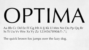
Herman Zapf was a book designer and type designer whose Optima san-serif font became ubiquitous on laser prints. It’s thick and thin lines made san-serif friendlier and easier to read. See more here.
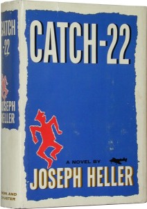
Paul Bacon designed thousands of book and record album covers during his career which spanned the last half of the 20th century. His “Big Book” style, with large author’s name and title, modernized book appearance and changed the way books were merchandized. You could read the title from across the room. Here’s the obit from the LA Times.


